Where Sepia Meets Rose: A Poetic Analysis of Victorian Chromatic Harmonies
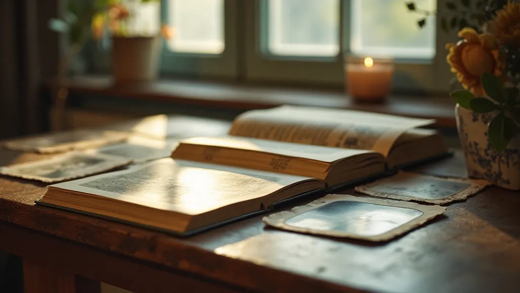
The scent of aged paper, the whisper of dried albumen, the quiet reverence for a moment captured – these are the sensations that draw me, and countless others, to the world of Victorian photography. But beyond the sepia tones that so often define the era, lies a vibrant, often overlooked realm: hand-tinted photographs. These weren't simply monochrome images begrudgingly splashed with color. They were carefully orchestrated chromatic harmonies, a poetic language spoken through subtle washes and intentional color choices, revealing a depth of artistry and emotional intention.
My own journey into this world began, unexpectedly, with an antique accordion. My grandfather, a collector of forgotten treasures, gifted it to me. As I struggled to coax a melody from its bellows, I began to understand the painstaking dedication required to bring something beautiful into existence, a process remarkably similar to the hand-tinting process itself. Each button pressed, each photograph hand-colored, demanded a level of skill, patience, and an innate understanding of craft that feels increasingly rare in our age of instant gratification.
The Monochrome Canvas: Understanding the Base Image
To truly appreciate the artistry of Victorian tinting, one must first understand the monochrome foundation. The collodion process, prevalent during much of the Victorian era, yielded exquisitely detailed negatives. These were then printed onto albumen paper, a fragile and delicate medium prone to scratches and fading. While the resulting prints were technically “black and white,” the nuances of the process – the developer used, the paper’s coating, even the ambient light during printing – influenced the range of greys and the overall tonality. A skilled photographer would manipulate these variables, understanding how to create a canvas perfectly suited for the colorist’s work.
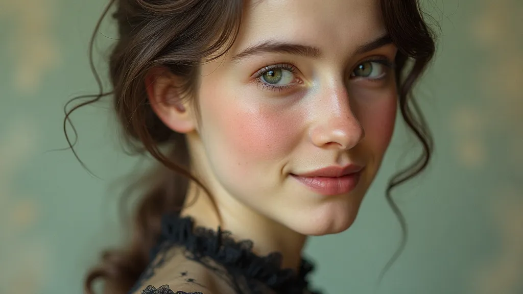
The choice of what to tint was also critical. Portraits, of course, were the most common subjects. However, landscapes, still lifes, and even documentary scenes were also given the hand-tinting treatment. The subject dictated the palette; a portrait of a rosy-cheeked child would invite warmer tones, while a moody Scottish highland scene would demand a more somber, earthy approach.
The Language of Complementary Colors
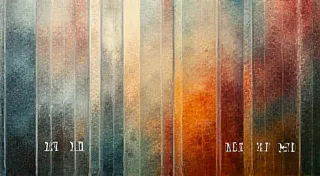
Victorian colorists weren't randomly splashing paint onto photographs. They were employing a sophisticated understanding of color theory, particularly the interplay of complementary colors. Think about it: red and green, blue and orange, yellow and violet. These pairings create a visual tension, a dynamism that draws the eye and enhances the overall impact of the image. While bold applications of these complementary pairs were rare, more subtle uses were common, adding depth and complexity to the tinted photograph.
Consider a portrait of a gentleman in a dark suit. The colorist might subtly tint the shadows with a hint of orange or a touch of violet, bringing out the richness of the fabric and adding a sense of dimension. Or in a landscape scene, a touch of orange on the foliage might intensify the coolness of the sky. These weren’t dramatic alterations, but rather carefully considered adjustments that enhanced the mood and atmosphere.
The choice of color also carried symbolic weight. Red, often associated with passion and vitality, might be used to highlight a blush on a child’s cheek or the vibrant petals of a flower. Blue, symbolizing serenity and trust, might be employed in the depiction of skies or flowing water. The colorist wasn't just adding color; they were adding meaning.
Beyond the Palette: Craftsmanship and Artistic Expression
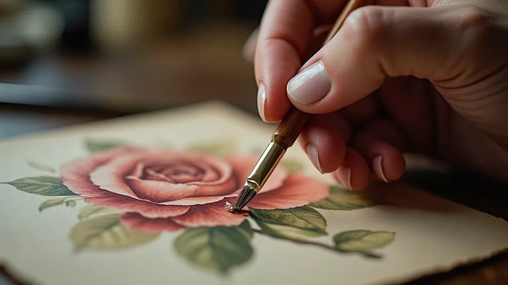
The materials used in Victorian tinting were as crucial as the color choices themselves. Watercolors were the primary medium, favored for their transparency and ease of blending. These were applied with tiny, pointed brushes, often using a technique called "stippling" to create subtle gradations of tone. The process demanded immense control and a steady hand. Mistakes were difficult to correct, and a ruined print was a significant loss.
The skill of the colorist was highly valued. Some studios employed dedicated colorists, who were essentially artists in their own right. They often developed their own signature styles, recognizable by their distinctive palettes and techniques. These individual touches are what truly elevate a hand-tinted photograph from a mere reproduction to a work of art.
The Legacy of Chromatic Harmonies
The decline of hand-tinting coincided with the advent of autochrome and other early color photographic processes. While these new methods promised greater convenience and accuracy, they lacked the artistic touch and subtle beauty of the hand-tinted image. The uniformity of machine-produced color often felt sterile compared to the warmth and character of a photograph painstakingly colored by hand.
Today, these Victorian chromatic harmonies are experiencing a renewed appreciation. Collectors seek out these beautiful artifacts, recognizing their historical significance and artistic merit. Restorers work diligently to preserve these fragile treasures, employing techniques that mirror those used by the original colorists.
Even for those not actively collecting or restoring, there's a quiet joy to be found in studying these images. They offer a glimpse into a bygone era, a time when photography was truly an art form – a fusion of technical skill, artistic vision, and a deep reverence for the moment captured. Looking at a Victorian hand-tinted photograph isn't simply looking at a picture; it’s experiencing a poem, a delicate dance of color and light, a testament to the enduring power of human creativity.